Seedream 5.5: step-by-step edits and transparent images
ByteDance demonstrated 100 successive edits and native alpha output. Here is what to check before using the results in ads and product cards.
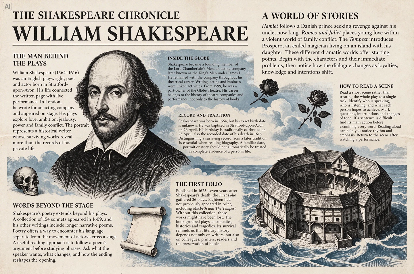
On November 9, ByteDance Seed introduced Seedream 5.5. The release brings three changes for image makers: more stable edits across successive rounds, native transparency, and what the team describes as improved rendering of small text and textures. For a designer or an ad producer, the practical idea is to keep a layout you already like, change individual details, and reuse the resulting graphic against several backgrounds.
How the editing sequence works
In ByteDance’s demonstration, the output of each round became the input for the next. The team used a single portrait to show successive changes to clothes, accessories, and objects on a table. The sequence ran for 100 edits. A separate example changes a room over time. When an object moves, the model has to redraw the newly visible floor and adjust the shadow to fit the new position.
The 100 rounds describe the developer’s demonstration. A more useful production check is to try three edits on your own material. Save the approved original separately and change one object per round. After each pass, compare the face, colors, logo, and framing with the original. If the type or composition starts to drift, go back to the last good version. With a single change per pass, it is easier to see which instruction caused the shift.
What the alpha channel adds
Seedream 5.5 can output RGBA directly: three color channels plus a channel for transparency. A pixel at the edge can be partly transparent, which matters for hair, mesh, glass, and other details that can look rough after a hard cutout. ByteDance’s official demonstration uses an owl with spread wings, including the gaps between its feathers.
For an editorial example, imagine illustrating a lamp for a product card. Keep the headline and price as separate layers in your editor. Place the image on white, dark, and colored backgrounds in turn. Check that the area outside the object is transparent and inspect how the edges look on each color. If you start from an actual product photograph, compare the generated object’s shape and proportions with the original before publishing.
What to check in small print
ByteDance shows an English newspaper layout about Shakespeare and an infographic with Chinese labels. The examples help illustrate dense layouts, while the developer’s reported measurements cover Chinese and English. For a Russian layout, inspect the letters and numbers at their final display size. Prices, ingredients, and mandatory copy are easier to proofread and update when you keep them as editable text in the layout.
The sources below include VIZURAI’s previous weekly roundup and its separate GPT Images 2.6 article, which covers markup-guided edits. If you are deciding how to make a series of layouts, compare two things on the same starting image: how precisely the intended detail changes and how much manual work remains before you can deliver the file.
Create your own result
Choose an available model and check its price in the studio.
Sources
- ByteDance Seed — Seedream 5.5 announcement and original examples
- ByteDance Seed — Seedream 5.5 model gallery
- VIZURAI — AI creative week, 2–6 November Published by the source:
- VIZURAI — GPT Images 2.6 and markup-guided edits Published by the source: